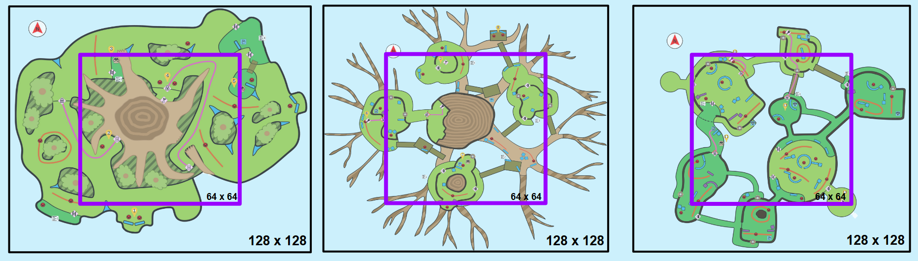
My first 2D layout was very large and messy, with pointless spaces that took focus away from the gaming experience. Many locations lacked distinct themes and felt repetitive, failing to stand out from one another. To improve the design, I carefully evaluated the map to identify which elements were essential and which could be removed. My goal was to ensure that every space and activity within the map served a clear purpose, driving the player toward their objective.

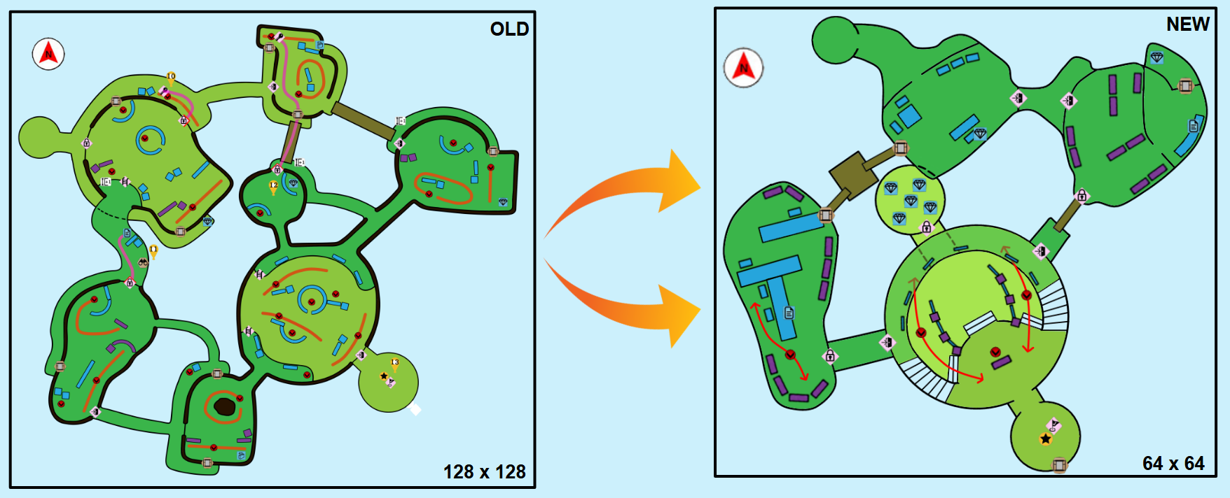
My initial map for the first level was massive, with enemy counts and metrics based on a 128x128 map size. To meet the new requirements, I reduced the tree’s size and closed off some of the open areas. The radial design made navigation confusing, so I created distinct zones separated by slight height variations and unique landmarks to help players orient themselves. Finally, I reworked the layout to be more linear, improving pacing and reducing backtracking.

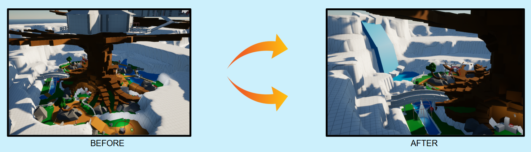
My original second-layer design was expansive, with numerous pathways and a sprawling 128x128 map size. In the newer map I reduced the surface area and compacted the layout, focusing on more direct routes while introducing pathways for stealth to support varied playstyles. The updated design prioritizes pacing and clarity, reducing traversal time and creating tighter, more engaging encounters while maintaining opportunities for strategic approaches.
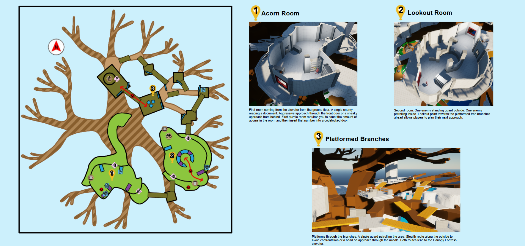
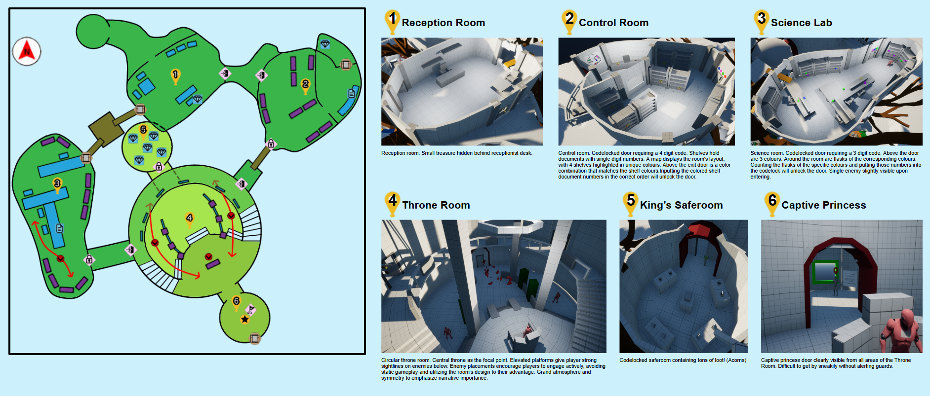
My original design lacked focus, with random, disconnected rooms that didn’t evoke the feel of a canopy fortress. In the updated map, I streamlined the layout, adding thematic elements to each room and giving the throne room a more regal identity. I also introduced puzzle-focused gameplay in the lead-up rooms, creating a smoother transition to the combat-heavy throne room while still maintaining that tighter pacing and clarity in the previous levels.
KEY FINDINGS
GAMEPLAY STYLE

Initially, in the section of the level where players traverse the middle branches, stealth players expressed frustration over the lack of a clear stealth path. They frequently got spotted by the enemy guard and felt uncertain about their route. To address this, I added a more defined outer path that made avoiding the guard more intuitive.
MAP DESIGN

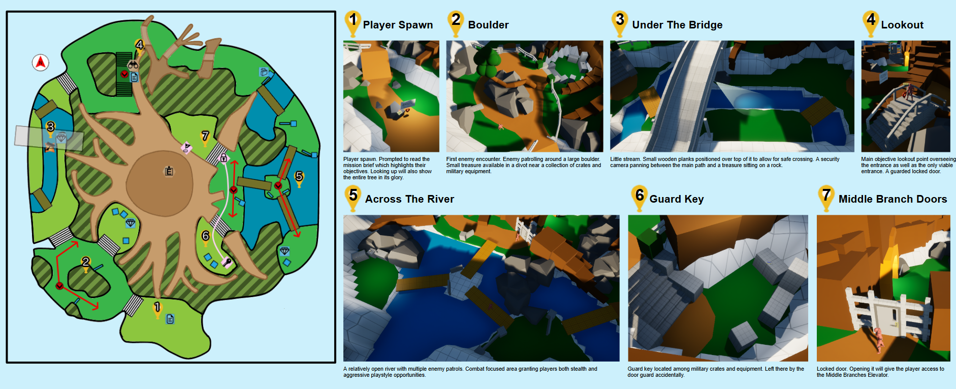
A significant portion of my level was set at ground level. While players didn’t find it particularly difficult to navigate, multiple feedback sessions highlighted the need for clearer path indicators. The mix of high and low elevations occasionally made it hard for players to identify accessible areas from their point of view. To resolve this, I introduced clearer pathways that subtly guided players toward locations that were otherwise difficult to spot.
My level had a radial layout, with players moving in a circular pattern at each stage. However, many players reported getting lost and struggling to locate objectives. To address this, I added a prominent landmark outside the level’s bounds to help players orient themselves and track their position. This change significantly reduced confusion and unnecessary backtracking.